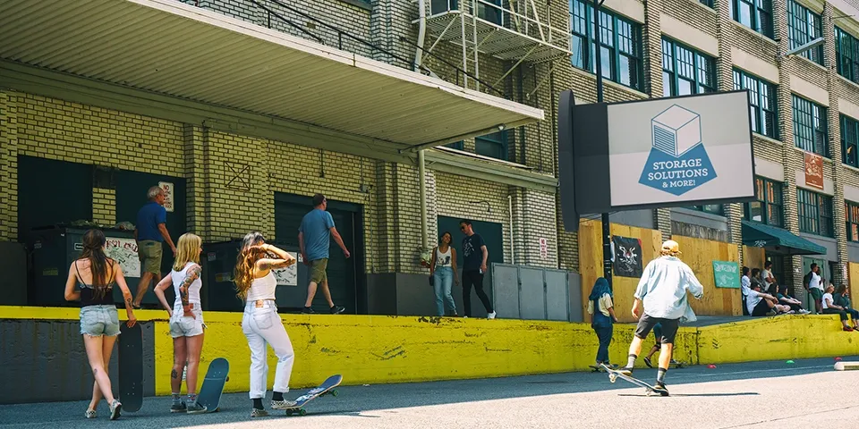
Storage Solutions Branding and Website
Project Overview
A new self-storage facility, “Storage Solutions,” needed a complete brand identity and a website to launch their business. The goal was to create a brand that felt secure and trustworthy, and a website that made it simple for customers to rent a unit.
Design Objectives
- Build Trust: The brand and website had to instill a sense of security, assuring customers that their belongings would be safe.
- Simplify the Rental Process: The website needed to have a clear and easy-to-use interface for finding, reserving, and paying for a storage unit.
- Create a Professional Online Presence: The overall look and feel had to be professional and modern to compete with established storage providers.
The Final Product
The new brand and website have been instrumental in the successful launch of Storage Solutions. The online booking system has been particularly effective, with a significant portion of new rentals coming directly through the website.
Key Design Elements
-
Strong and Secure Logo
The logo uses a bold, geometric font and a stylized lock icon to convey a sense of security and reliability.
This immediately builds trust and communicates the primary benefit of the service: safe and secure storage.
-
Simple and Intuitive Website UX
The website is designed to make it as easy as possible for users to find available units, view pricing, and complete a rental online.
A streamlined user flow reduces friction and makes the process of renting a storage unit straightforward and hassle-free.
-
Clear and Transparent Pricing
The website features a clear pricing table that allows users to easily compare the sizes and costs of different storage units.
This transparency builds trust and helps customers make an informed decision without hidden fees or surprises.
-
Integrated Online Booking System
An e-commerce system is integrated into the website, allowing customers to reserve and pay for their storage unit directly online.
This provides a convenient, self-service option that is available to customers 24/7.